Tuesday, 30 December 2014
Monday, 29 December 2014

Thursday, 18 December 2014
Wednesday, 19 November 2014
Monday, 17 November 2014
Friday, 7 November 2014
Thursday, 6 November 2014
Wednesday, 29 October 2014
Tuesday, 28 October 2014
Wednesday, 22 October 2014
Tuesday, 21 October 2014
Thursday, 16 October 2014
Music Magazine
I will be producing a new music magazine, based on a specific genre of music. This magazine will include a cover, contents page and a double page spread. In order to produce this, I will be using Photoshop for image manipulation and InDesign for page layout and design features for both the contents page and article.
Thursday, 9 October 2014


Tuesday, 7 October 2014
Monday, 6 October 2014
Magazine Pictures
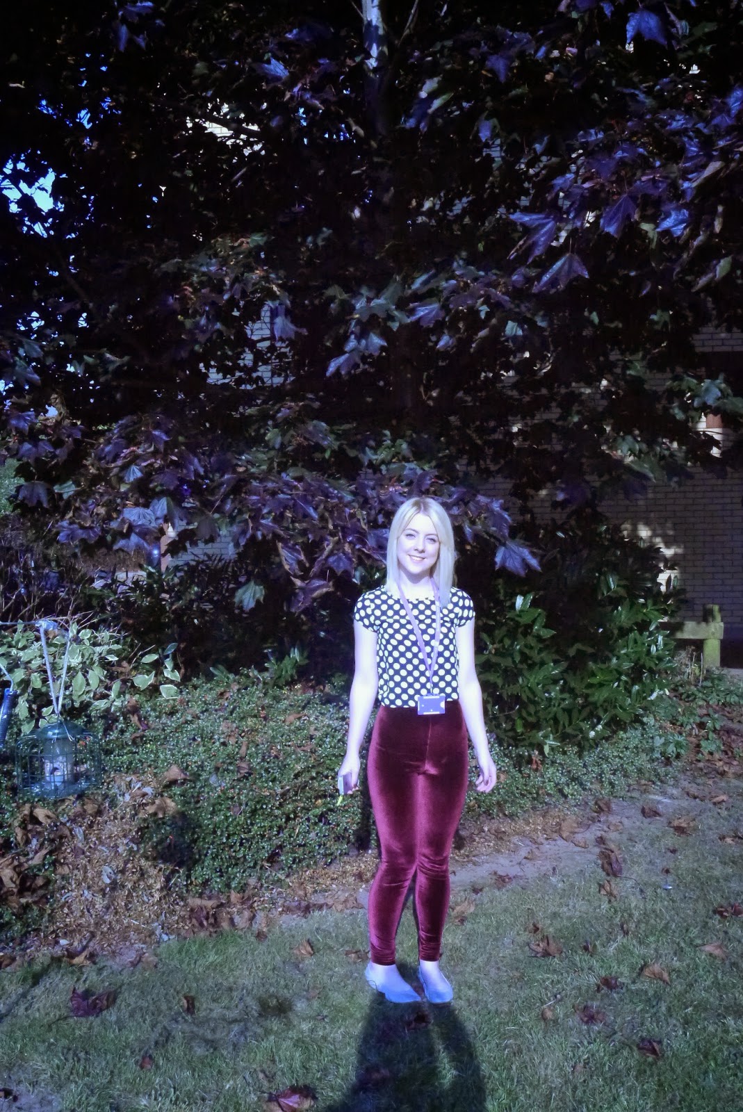
This image incorporated the
college colours, purple and green. Thus, creating mise-en-scene, to demonstrate
a personal and mysterious feel. This personal feel is reflected by the feature
(Joellen) in the main image. By including a student, there is an immediate
connection between the magazine and its target audience.

This image made a personal and direct link between the front
cover and the contents page, which highlights a consistency throughout the
magazine, so that the target audience are able to recognise a specific house
style. Also, by presenting a consistency it is clear to the audience what the
intended purpose is, which is important in relation to the codes and conventions
of magazine design.
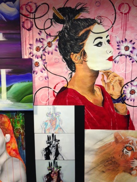
The use of student’s work highlights the persona of the
magazine. The personal connection between the magazine and the target audience
makes the intended purpose clear, so that the reader is more likely to purchase
the magazine. Also, by featuring a student’s work it creates awareness for the
college’s own respected students and their work.
Thursday, 2 October 2014
Student Risk Assessment 2
STUDENT
RISK ASSESSMENT
Date
18.09.2014
|
Location: Media Studies
Inside
the Art and Design Block
|
Task
being assessed: Students taking photos in college
General
Risk assessment
|
Student
Name: Emily Fish
|
|||||||
HAZARDS
|
DEGREE OF RISK
|
CONTROL MEASURES
|
ACTION PLAN
|
|||||||
Hazard
Regardless of control
measures
|
Persons at risk
*1
|
Worst outcome
*2
|
Probability
*3
|
Risk Rating
A-E
|
Existing control measures taken against the risk
|
What further control measures are required when and by whom
|
||||
1.
Could collide with the corners of table.
2.
Drawings on the wall could fall off/start to peel.
|
1.
St
2.
St, Sf, V
|
1.
NR
2.
NR
|
1.
U
2.
R
|
1.
E
2.
D
|
1. Be aware of surroundings and take photos in a
clear space.
2. Check that the environment is secure and the
drawings are safely attached to the wall.
|
1.
Move furniture, in order to clear an appropriate space.
2.
N/A
|
||||
*1
Sf
= staff
St
= students
Cr
= contractors
Cl
= cleaners
V
= visitors
|
D
= people with disabilities
X
= young/inexperienced
L
= lone workers
W
= women of child-bearing age
|
*2 This is without control measures
F
= fatal
Maj
= major injury or permanent disability
Min
= minor injury
NR
= non-reportable
|
*3 This is with control measures in place
Fr
= frequent/likely/could occur repeatedly/expected
Pr
= probable/not surprised/might occur often
Ps
= possible/could occur sometime
R
= remote/unlikely but conceivable
U
= unlikely/improbable such that likelihood is almost zero
|
|||||||
Risk
Rating
A
= Highly likely
B
= Likely
C
= Even chance
D
= Unlikely
E
= Highly Unlikely
|
||||||||||
Student Risk Assessment 1
STUDENT
RISK ASSESSMENT
Date
18.09.2014
|
Location: Media Studies
Gardens
outside of the Art and Design Block.
|
Task
being assessed: Students taking photos in college
General
Risk assessment
|
Student
Name: Emily Fish
|
|||||||
HAZARDS
|
DEGREE OF RISK
|
CONTROL MEASURES
|
ACTION PLAN
|
|||||||
Hazard
Regardless of control
measures
|
Persons at risk
*1
|
Worst outcome
*2
|
Probability
*3
|
Risk Rating
A-E
|
Existing control measures taken against the risk
|
What further control measures are required when and by whom
|
||||
1.
Collide with the bird feeder.
2.
The grass is wet, so someone could potentially slip over.
3.
Leaves could make the ground uneven/unsteady.
|
1.
St
2.
St
3.
St
|
1.
Min
2.
Min
3..
Min
|
1.
U
2.
R
3.
U
|
1.
E
2.
D
3.
E
|
1. Check for surroundings and that we are stood
clear of the bird feeder.
2. Take care when walking on the grass (walk
slowly).
3. Clear the area of leaves.
|
1.
Move the bird feeder whilst we are taking pictures.
2.
Wear suitable footwear and only proceed with photography when the ground is
dry.
3.
N/A
|
||||
*1
Sf
= staff
St
= students
Cr
= contractors
Cl
= cleaners
V
= visitors
|
D
= people with disabilities
X
= young/inexperienced
L
= lone workers
W
= women of child-bearing age
|
*2 This is without control3measures
F
= fatal
Maj
= major injury or permanent disability
Min
= minor injury
NR
= non-reportable
|
*3 This is with control measures in place
Fr
= frequent/likely/could occur repeatedly/expected
Pr
= probable/not surprised/might occur often
Ps
= possible/could occur sometime
R
= remote/unlikely but conceivable
U
= unlikely/improbable such that likelihood is almost zero
|
|||||||
Risk
Rating
A
= Highly likely
B
= Likely
C
= Even chance
D
= Unlikely
E
= Highly Unlikely
|
||||||||||
Location Reccee

This image incorporates a college student, which corresponds to my main cover line, as it is personal and features the person herself, directly addressing the target audience. Also, the background colours, purple and green, relate to the colour scheme I am going to use throughout my cover page, which will sustain a consistent house style.

This background would express the work of students, so it is personal and immediately engages with the target audience, as they would be able to recognise their own work or work of friends. This personal sense of the magazine would create a mise-en-scene, as it denotes hard work, commitment and determination, as well as artistic creativity.


Thursday, 18 September 2014
College Magazine Research
The first magazine demonstrates a successful form of direct address, as the girl who features in the main image makes clear eye contact with the target audience. This is important as it immediately engages the reader with the magazine. Additionally, the main image is well cropped and centred, so in terms of the Rule of Thirds, her face would fit into the centre of the grid, which is important for the magazine's layout. The cover lines and Masthead are also relevant to the house style, as there is a clear colour scheme and simplistic, yet professional layout, which is suitable for its intended audience and purpose. In addition, the cover lines, such as 'Lucy's Path' are personal and positive, which in relation to the main image engages the reader and is relevant to the target audience, as the fellow College Students can relate to the feature's College Lifestyle.
On the other hand, the feature in the final magazine fails to make any contact with the target audience, which denotes a negative persona, as it suggests the boy in the main image is not really interested. In relation to the main image, the cover lines are poorly arranged around the main image, as some words run onto the next line, there is poor grammar and the colour does not correspond with the house style; whilst there is a lack of consideration for the Rule of Thirds, since they are all arranged to the left of the main image. Also, in terms of the house style, the masthead should follow the appropriate conventions and be presented in bold at the top of the page, rather than on the side, which can make it difficult to be recognised by the target audience. Whilst the colour choice is unappealing, as the colour green has been overused and without the use of different graphics and fonts, the cover appears boring.
Wednesday, 17 September 2014
A Little Bit About Me
 Hello, my name is Emily Fish and this is my first time doing Media Studies, as I was unable to choose it as an option at GCSE. So far I have thoroughly enjoyed the course and look forward to continuing with my coursework. Thus, I hope to achieve high grades in AS and A2, as I believe it will be an important qualification to pursue in a career in journalism. This career choice was partially influenced by media texts, as I enjoy reading various magazines, such as 'Company', as well as enjoy watching films. Moreover, I am quite a confident person and like to participate in a range of activities, which is demonstrated by my former roles at Secondary School, including Head Girl. Therefore, I feel these attributes will help me to succeed in my A Levels.
Subscribe to:
Comments (Atom)